GRAPHIC
DESIGN
UNIVERSITY OF KANSAS
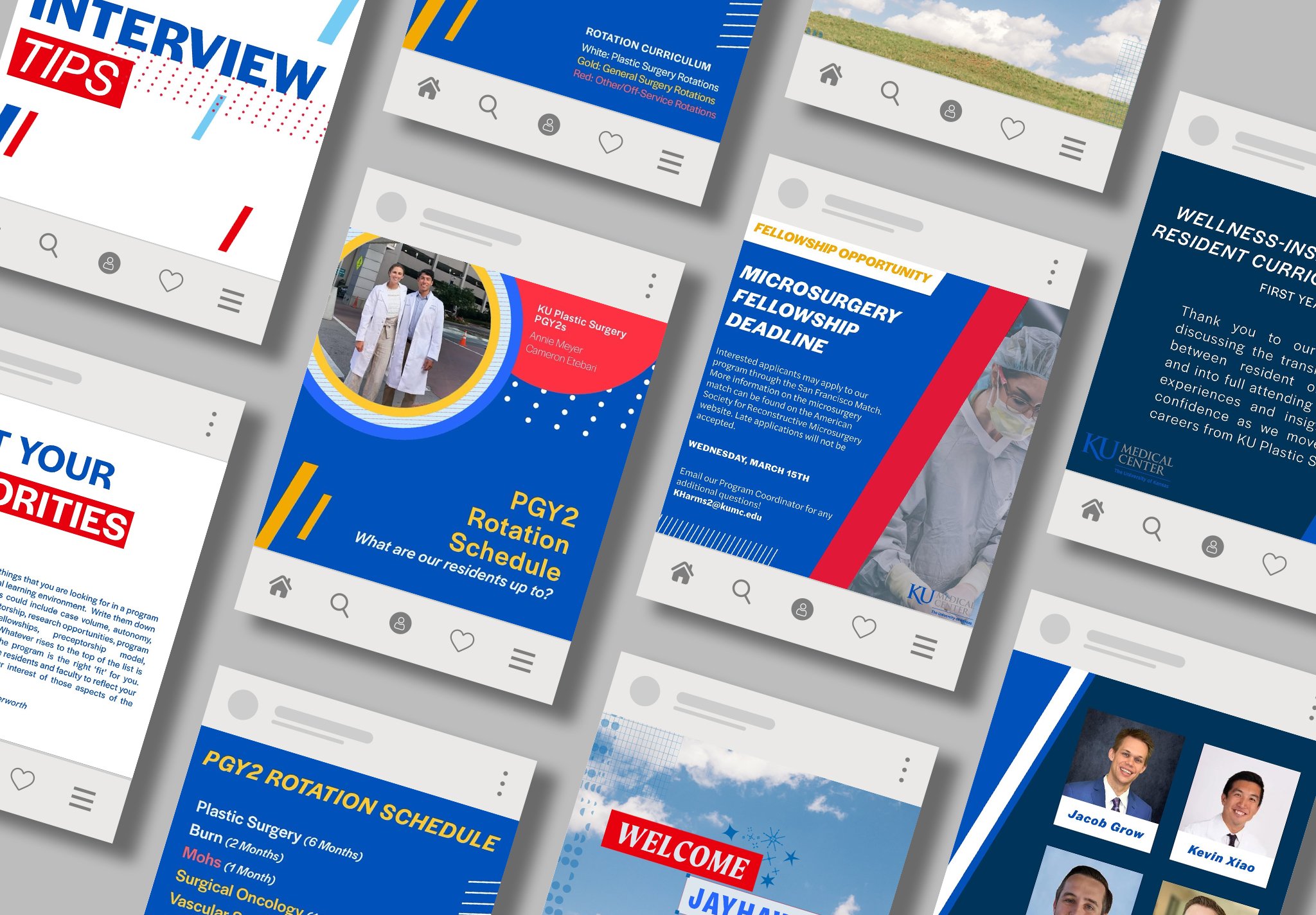
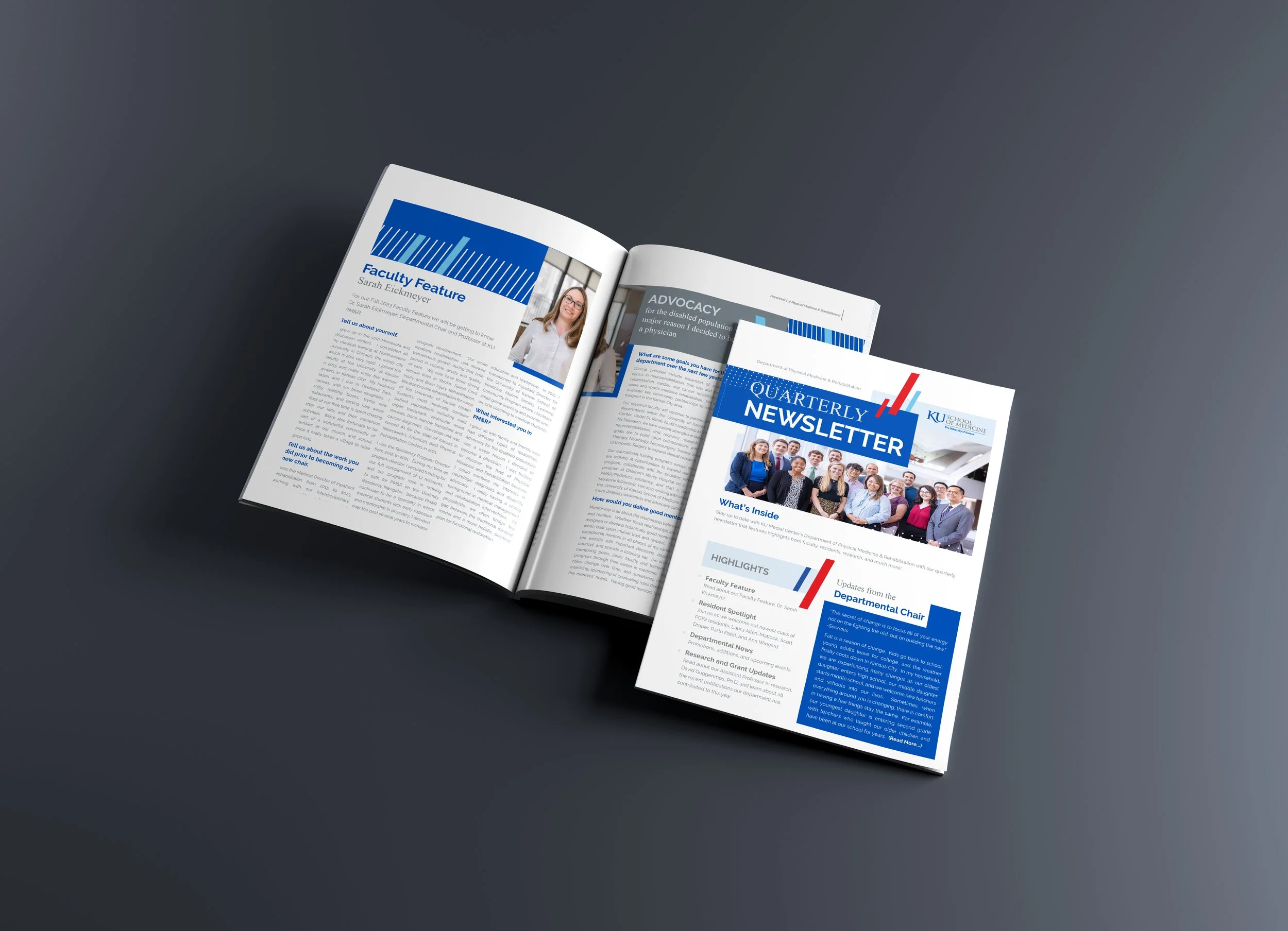
At KU Medical Center, I’ve worked closely with the Departments of PM&R and Plastic Surgery to design a wide range of creative materials that meet both day-to-day and large-scale needs. From social media graphics and internal newsletters to conference research poster templates, in-person collateral, and large event signage, I’ve developed materials that align with brand standards while remaining flexible for departmental messaging. Whether it's a last-minute flyer or a full event campaign, my goal is always to create thoughtful, clear, and engaging design that supports both the staff and the patients we serve.
Note: during this time, I have designed under two different brand campaigns, our current one, Towering Toward the Blue, and our previous one, Our Chant Rises.


BLANCARTE GRANT CONSULTING
I assisted Jaci Blancarte, a freelance grant consultant, with creating all graphic assets, a new website, business cards, and portrait photography for the launch of their new brand “Blancarte Grant Consulting.” Knowing the client from work at KU Hospital, I had insight into the type of person Jaci is. This made the creative brief an easy process because I knew exactly what kind of questions I needed to ask to complete the deliverables on time. We talked about look, feel, and colors that would help represent her as a person, but also make her stand out from the traditional type of grant consultant business. This notion of standing out became a slogan for the business, which is included in the visual design and on the business cards.


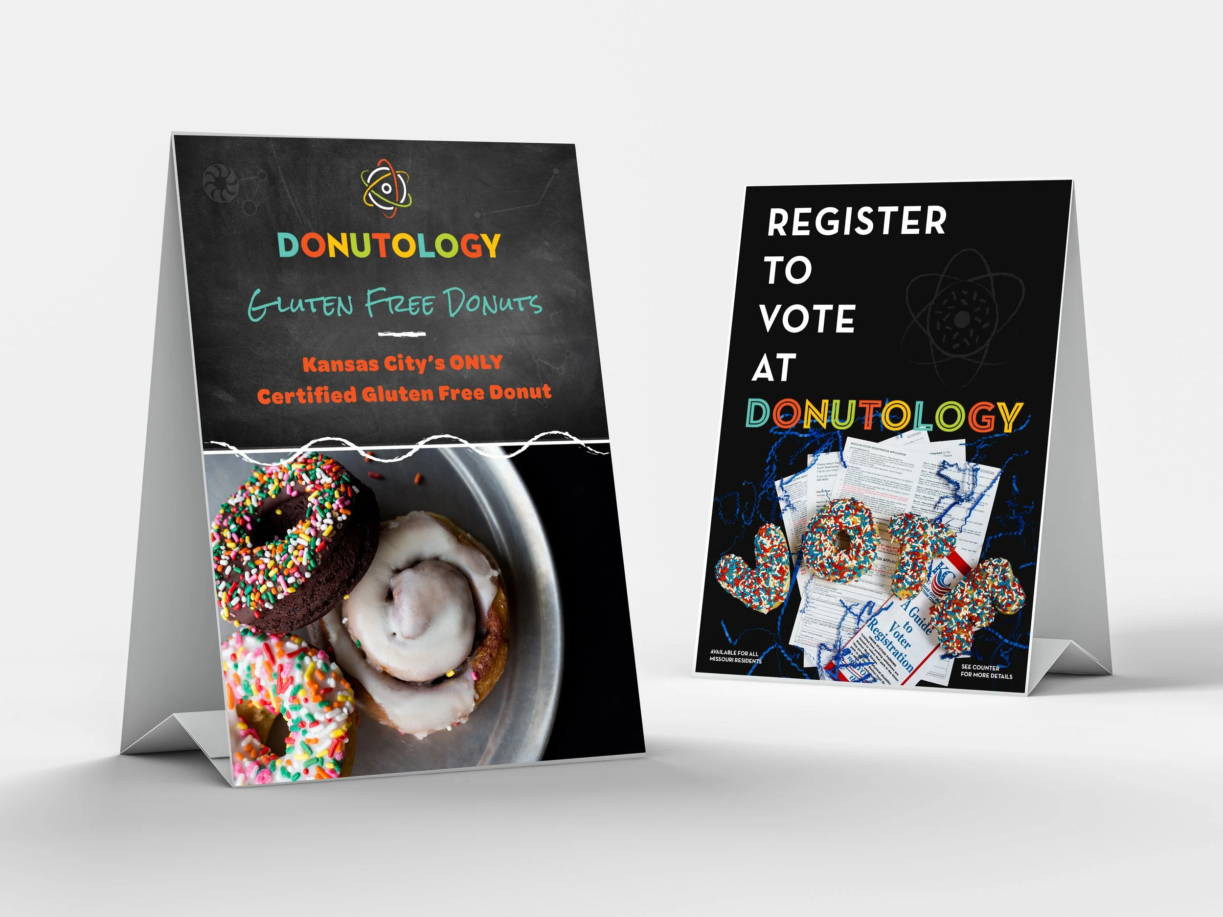
FOOD & BEVERAGE
Working with a variety of restaurants across the Kansas City area, I’ve created tailored visual assets to support each brand’s unique personality and customer base. From designing social media graphics and email newsletters to menus, table toppers, and promotional materials, I’ve helped local spots connect with their audiences in meaningful, on-brand ways. Understanding the fast pace of food service marketing, I focus on delivering creative that’s clear, eye-catching, and effective—whether it’s a last-minute lunch special or a full campaign rollout.


MINI BRANDING:
CENTRAL SOCIETY
The previous program director for KU PM&R reconnected with other educational institutes around the Midwest, which was deemed the Central Society. The Central Society was meant for networking, connection, education, and research development within the PM&R specialty. It included the states of Missouri, Kansas, and Nebraska, which were my starting point for the logo, which I stacked into a spine shape. I also utilized half circles that were filled in or outlined and then placed together to create a whole. The colors were also based on the Midwest rolling hills, vast skies, and earthy reds. My intention with these graphic elements and colors was to illustrate how the Central Society collaborates with each state to achieve its education and research goals as a team.


